
HDG #006: How to do a community assessment in minutes

Read time: The minutes it takes you to do an assessment like this
Today I'm going to tell you how to pull a quick but robust community assessment profile in minutes—and point you toward a narrowed list of data tools I have spent just about 2 weeks vetting for ease of use, breadth, and value (so that you don’t have to).
Think community needs assessment is just for tax-exempt hospitals and feel-good policy-making?
Think again.
I might be convinced of that if we’re using the most narrow sense of the term. But as always, I like to connect the dots across bigger silos! Everyone working in health/community has a use case for this kind of analysis and can absolutely benefit from what I’m going to share.
Payer/managed care/health plan? This can help you identify targeted, strategic programs to address the health needs of a patient population in a region, design new benefits that address community-level determinants of health, expand access to medical care, and develop a new health equity strategy.
Medical/ancillary provider, community-based organization, or non-profit? This can help you understand the population of people or neighborhoods that you serve, what is most important to them, and where/for what issues they need the most help. It can also help you identify strategic areas of growth/expansion, ideate new policies, and support funding requests via grants and new reimbursement models.
Government? This can help you pinpoint areas in need of new policies and programs, evaluate program effectiveness, compare and understand your constituent groups, and identify gaps of interest to you in the communities your serve (whether that be gaps in education, opportunity, broadband coverage, etc.)
A third-party health tech vendor, services provider, or consultancy? This can help you go in with a well-crafted pitch, pre-ideate solutions that will resonate, form a baseline idea of what to hone in on, and even pull some preliminary data to help illustrate the need for your services.
What goes into such an assessment?
Like any analysis, there are many different methods. The CDC explains them here and even lists principles to consider from The George Washington University School of Public Health and Health Services, Department of Health Policy—and posted a guided workbook too (warning: circa-2013 alert)
The IRS requires the following in Community Health Needs Assessment (CHNA) each year:
Define the community it serves.
Assess the health needs of that community.
In assessing the community’s health needs, solicit and take into account input received from persons who represent the broad interests of that community, including those with special knowledge of or expertise in public health.
Document the CHNA in a written report (CHNA report) that is adopted for the hospital facility by an authorized body of the hospital facility.
Make the CHNA report widely available to the public.
Some Google searching will turn up different frameworks and ideas, even companies that can do these for you. All of that is quite broad and vague—and it should be easier to answer questions about communities.
Here’s how Gurus can do this—quick and simple.
I’ve broken it down into the 3 Key Areas where I find the most value to inform the use cases I rattled off above, with links to data sites where you can get the info by region.
1: Demographics & sociocultural/economics, e.g.:
Household composition
Population growth trends
Education
Race, Ethnicity, and Language (REaL)
Employment & Wages
Uninsured
Census data clearly rules this category, but their website usability can be… really... challenging. I tend to prefer other sources that are faster and more consumable.
To pull a single-region data profile:
Data USA is hands down the best for a quick and simple, but very robust, community data profile. This regional profile also goes well beyond just demographics, getting into economics, civics, education, and some interesting health metrics (like patient-to-clinician ratios, community mobility, and healthcare diversity). Most data is also in trend format so you can see changes over time. As much as I love this website, it is not great to compare regions or click around hot spots, though they do have a map view and report builder with some limited capabilities.


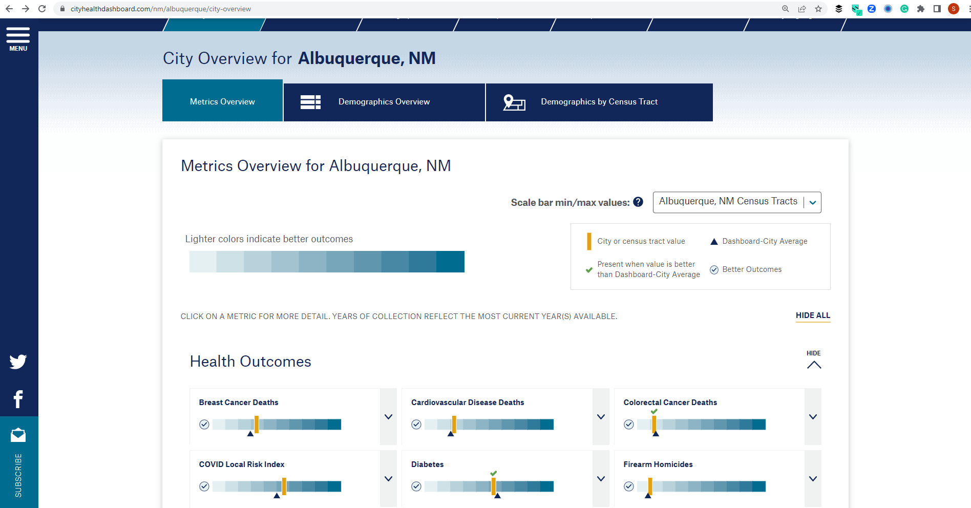
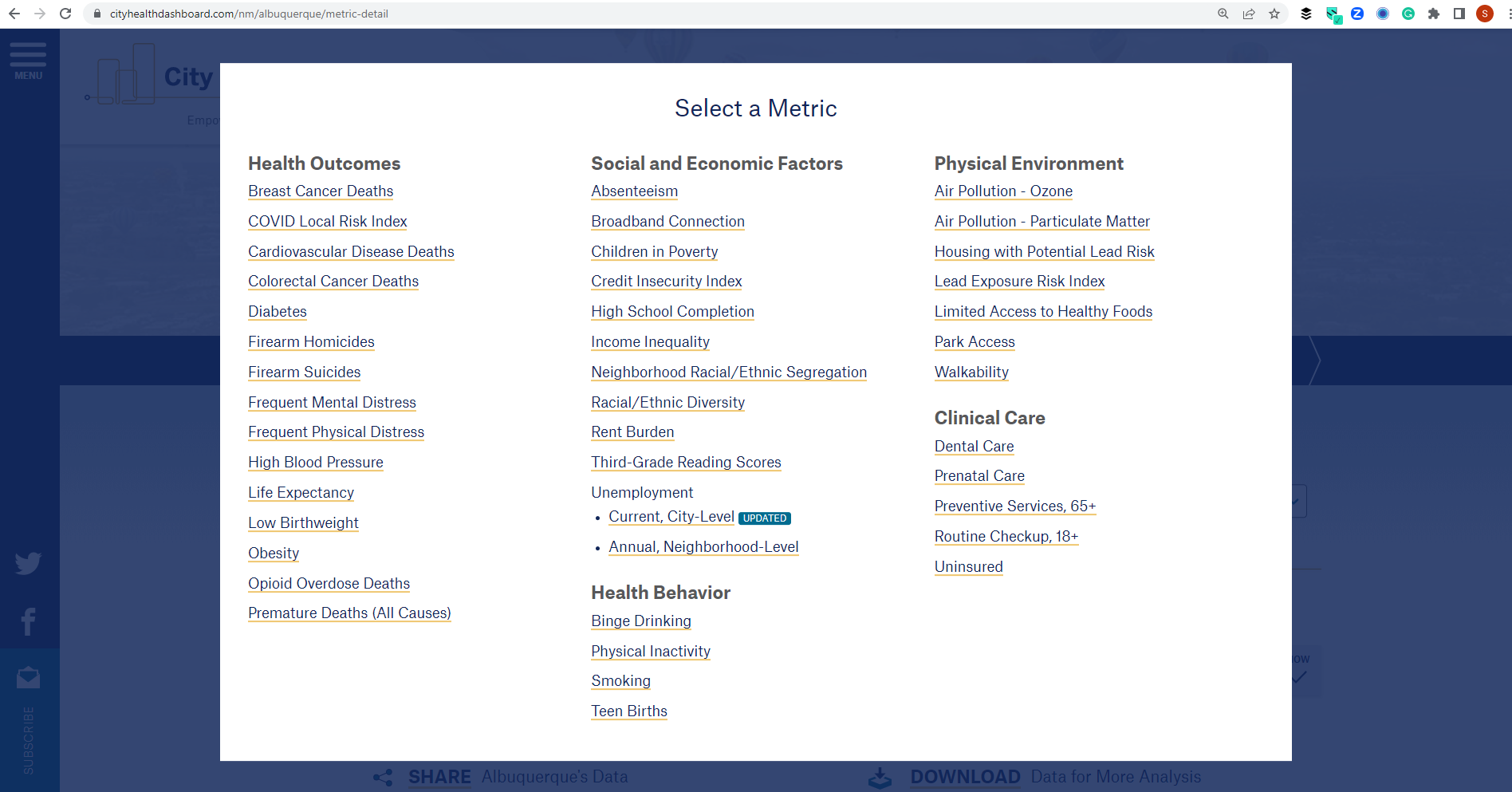
City Health Dashboard is quickly rising up my favorites list. Wide-breadth of data is a little more limited, but rightly so, as this tool is focused on health indices. And for a one-stop profile to quickly pull a city for an idea of what the health status looks like, it takes the cake here. Useability is super simple, clean, and just as beautiful as Data USA. Check out the beautiful interface and all the health-specific measures. Downside: larger metro cities only.

Now, to compare different regions:
I like geospatial sites best for clicking around neighborhoods to see the differences in whatever metric of interest. The challenge is finding one that is easy to navigate, has the data that you need, and goes to the geographic granularity that you want (county, city, census tract, zip, etc.). Here are a couple with demographics & Sociocultural/economics:
2020 Census Demographic Data Map Viewer
View demographic information by Census Tract. Site is limited to just Census Demographic data indicators, but it does a decent job.

Has lots of different data to explore, but the free version only allows you to see one layer at a time and limits your ability to edit the color/intensity. Still, a lot of interesting data is available and some (not all) are available by many different geospatial granularities like state, county, tract, zip code, district, and even watershed/basin.

Similar to PolicyMap. The interface is not as easy to use as PolicyMap, but the ability to layer multiple datasets and modify their transparency—plus the sheer amount of healthcare-related metrics available—more than makes up for it. If PolicyMap doesn’t have the metric you’re looking for, I’d also look in SparkMap. The datasets are quite different in some domains.

2: Health Burdens & Healthcare Trends
PolicyMap and SparkMap have some of the data I’ll mention below, however, I’m going to link different websites here that are specific to healthcare in the event that the above was too broad a stroke.
Chronic Condition/Disease Prevalence
Always check your local state Department of Health for vital statistics and other health conditions
CDC Places has 13 chronic conditions “biggies” and they also have a map, tract level.
CMS has an interactive atlas for 18 conditions (Medicare only) by county. This also tells you how many Medicare fee-for-service patients there are in each county.
Inpatient Admissions & Emergency Dept Trends
AHRQ HCUP might be the most robust, but it’s not always straightforward or at the granularity you want. Still, you can find inpatient admits, readmits, and emergency department trends (with some diagnoses) and states must report this data.
Cost & Quality of Care
The Healthy Marketplace Index (HMI) from the Healthcare Cost Institute is limited to very urban regions but has interesting data about how those regions compare in cost, competition, and services. And it is all compared to national averages.
The Sage Transparency tool is more hospital-based but shows the estimated payer mix, how hospitals compare to others for cost and quality, and lists hospitals in the state so you can compare. This would come in handy if you are researching a specific region that tends to visit a particular hospital for care. Another similar hospital-based data tool that can inform your analysis is the American Hospital Directory, which allows you to look up a hospital's profile of services, top patient originating zip codes, total charges and payments annually, beds, accreditation, etc.
Provider Locations & Distances
I like the CMS NPPES NPI Registry best to look up providers in a certain region, but some of the mapping tools I mentioned above had distance and access metrics (such as physician-to-patient). Some also had the ability to add locations of hospitals and other providers onto the map layer if you need to see what kind of care is in a certain area.
Health Equity
County Health Rankings scores counties on a number of different measures.
There is also this more narrowly-focused Health Equity Tracker.
3: Accessibility & Environment
Broadband Access - mobile and fixed. The FCC has even developed a couple of health-specific overlays (such as mapping obesity and physician shortages against broadband access).
Food Access - how many fast food restaurants per head, food assistance data, low access to the grocery store, etc. Unfortunately, it is only at the county level but the data is fairly unique data from the USDA.
Other Social Determinants of Health: did you know AHRQ has an SDOH Database with a lot of healthcare-specific things at the zip code and Census tract level? I certainly did not. An expected bit of it is sourced from the Census, but they also have a fair amount of other unique sources in there, like: hospital beds per 1000, different types of specialists per 1000, ED visits per 1000, literacy measures—lots of interesting stuff.
Social Vulnerability Index & National Risk Index: composite indices that compare the vulnerability of communities socially and from a natural hazard risk perspective, respectively, at the county or census tract level.
If you were to only use these tools, you’d be able to tell me:
What the composition of its residents looks like and how vulnerable they are (if it is a metro area, how that varies by neighborhood)
What kind of chronic health conditions they tend to have and how they tend to utilize care
If there are any medical specialist shortages to treat those conditions and for which conditions
How that ties into access and environmental issues, like food access, broadband, and REaL data
Which hospitals in the area serve them, what kind of services they focus on, and how well that care is delivered
Hot spots where the specific areas that have multiple different risk factors combined are
How far they have to travel for necessities like groceries, medical care, etc.
What kind of environmental hazards they face
And a whole lot more….
Not too shabby.
I could most definitely develop a community profile report from this data alone.
I could most probably develop a few hypotheses or program ideas from this, especially if I pair those insights with qualitative learnings gleaned from talking to people living in the community.
I could very likely make an educated decision about what kinds of programs/policies are going to be major goals for health equity initiatives.
And we have barely scratched the surface on other community data living out there in the wild web. Now imagine if we threw some predictive or prescriptive analytics on top of this?
Vroom Vroom!
Actionable Idea of the Week:
Use one of these websites the next time someone asks you a question about a certain city, region, or neighborhood. Even better, use one when you’re designing a new program or initiative.
For funsies, maybe even play around with these sites to try to find an interesting nugget about your own community that you didn’t already know. For example, today I learned that some neighborhoods in my town have a surprisingly wide variety of countries from which its foreign-born residents emigrated.
What other resources should we add to this list? Hit reply and let me know your thoughts.
See you next week!
-Stefany